About the project
As my first attempt at designing an app, WordStorm was developed as an exercise to help me learn and understand the process of UX Design.
The goals were to create an app that could help users build their vocabulary by reviewing words, testing their knowledge with quizzes, and uploading words of their own.
What is WordStorm?
WordStorm is a vocabulary learning app for people learning English or people who are looking to improve their skills. In WordStorm, users can test their knowledge daily, review and study words on their own time, and test their progress with
quizzes.
My process
Research
For WordStorm, I focused on researching the current market landscape for vocabulary-learning apps. After selecting 5 competitors, I looked at their strengths, weaknesses, and thought of new ways to best meet a user’s needs.
After surveying the competitor landscape and seeing what they were doing well and what could be improved upon, it was time to start researching.
Research goals
My goals were to understand how likely users were to use an app for learning vocabulary, how often they were likely to use such an app, for how long, and what made learning new words difficult.
Methodology: User interviews
To get started, I interviewed 3 people and asked them 6 questions about their experience learning new words and building their vocabulary. After the interviews, I sorted my observations into 3 categories: Thinking, Feeling, and Doing.
The interviews also allowed me to discover important aspects WordStorm would need to be successful. The app would need:
- Repetition. Users best learn new words after being exposed to it numerous times.
- Examples. It’s nice to know what a word means, but knowing what a word means is different than knowing how to use it in a sentence. Users would benefit from seeing how to use words and seeing how they work in a sentence.
- Visuals. The app would need more than simple definitions. Users would also benefit from pictures that could solidify understanding.
- Voice features. To truly help users build their vocabulary, voice would be needed to show users how to pronounce a word without having to rely on phonetic spelling.
-
Positive reinforcement. No one likes feeling stupid, so why would we want to use an app that makes us feel dumb? Users need an app that doesn’t penalize them for getting the wrong answer, and instead focuses on growth and
progress.
Proto-persona: Alina
After conducting the user interviews it was time to build the proto-persona. Since the point of the project was to focus on learning the process of UX Design, and the deadline was fast-approaching, I created a proto-persona.
This allowed me to dip my toe into persona ideation without getting lost in the weeds.
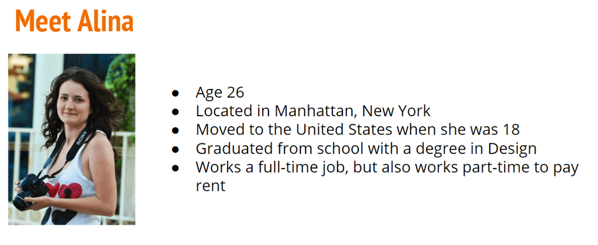
Proto-persona: Alina, the Self-starter.
Alina’s key characteristics
- Communicates with co-workers and leadership to finish deliverables.
- Faces pressure to keep up with the latest trends and Google updates.
- Needs expressive language to convey concepts and stories to both clients & coworkers.
Alina’s needs
Thanks to the user interviews, I was able to establish Alina’s primary needs based on the data.
- Alina needs to be able to track her progress as she learns new words.
- She needs to learn in her limited free time, and use only about 5-10 minutes per day.
- She needs to be able to upload words herself so she can focus on words she encounters during her day-to-day travels.
Alina’s user stories
- As a visual person, I want to be able to track my progress with a progress bar or other visual clue so that I know how much of my study session is left, and feel accomplished with how far I’ve come.
- As someone with a busy workday, I want to be able to learn vocabulary during my daily commute with short, actionable study sessions (of 5-10 minutes) so I can use my time as efficiently as possible.
- As someone speaking English as a second language, I want to learn from a list of words that are new to me so that I don’t have to go through and upload all of the words myself.
- As someone who learns through repetition, I want to use flashcards to execute repetitive, but engaging, tasks that test me along the way so I know what I’m learning and what I need improvement on.
- As someone who wants to learn words to improve communication at work, I want to be able to “star” or “favorite” certain words so that I can come back to them later.
Alina’s job stories
- When I select correct answers, I want to feel accomplished by earning points or receiving praise so I can feel encouraged to continue learning.
-
When I select incorrect answers, I do not want to feel like I am being penalized for something that I don’t know (like losing health), or feel like I’m missing something I should know, so I can feel like I can learn from
mistakes without
being hard on myself. -
When I encounter a word I don’t know, I want to be able to view information on the word including images, definitions, synonyms, antonyms, sentence use, and pronunciation (normal and slow), so I know what the word means
next time I
encounter it. - When learning new concepts, I want to have what I’m learning to be sorted into three categories: “new,” “learning,” and “learned,” so I can know where I stand.
- When I start a new program, I want to be incentivized to keep learning, with a points system so I do not lose interest or give up. I am competitive, so being able to compare where I am versus my friends may also help.
Problem Statement & Hypothesis
Problem Statement
Alina needs a way to learn new language skills in short, actionable segments because her busy schedule does not allow her to have much leisure time.
Hypothesis
We believe that by building an app for Alina that:
- Tests and tracks user progress in an active way,
- Teaches concepts in short & repetitive bursts,
- Sorts words into sections like “new,” “learning,” and “learned,”
- Incentives users to dedicate 5 to 10 minutes a day,
- Rewards users for correct answers, and does not penalize for incorrect answers, and
- Utilizes images, pronunciations, definitions, synonyms, antonyms, and context
we will achieve a fun, engaging vocabulary learning app that can help Alina reach her goal of improving communication skills on a tight time budget.
User task flows
After completing the proto-persona, I created user task flows to help me figure out and solidiy how Alina would navigate the app.
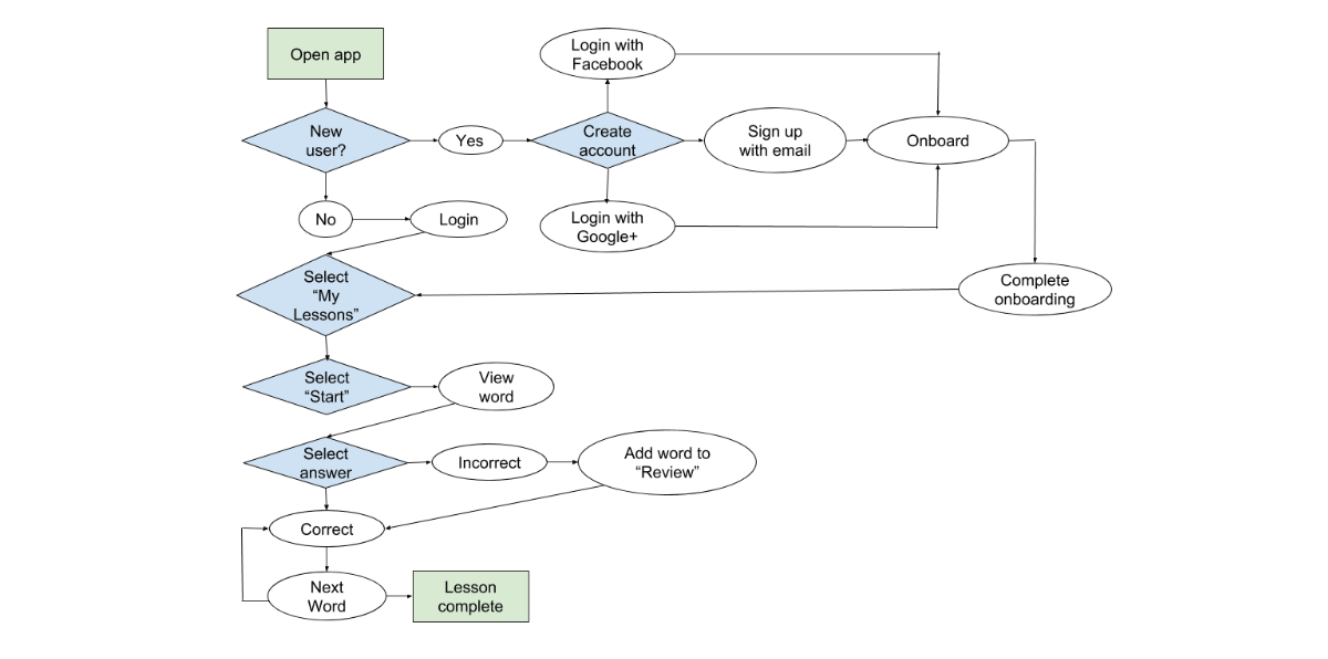
Task flow: Complete a lesson.
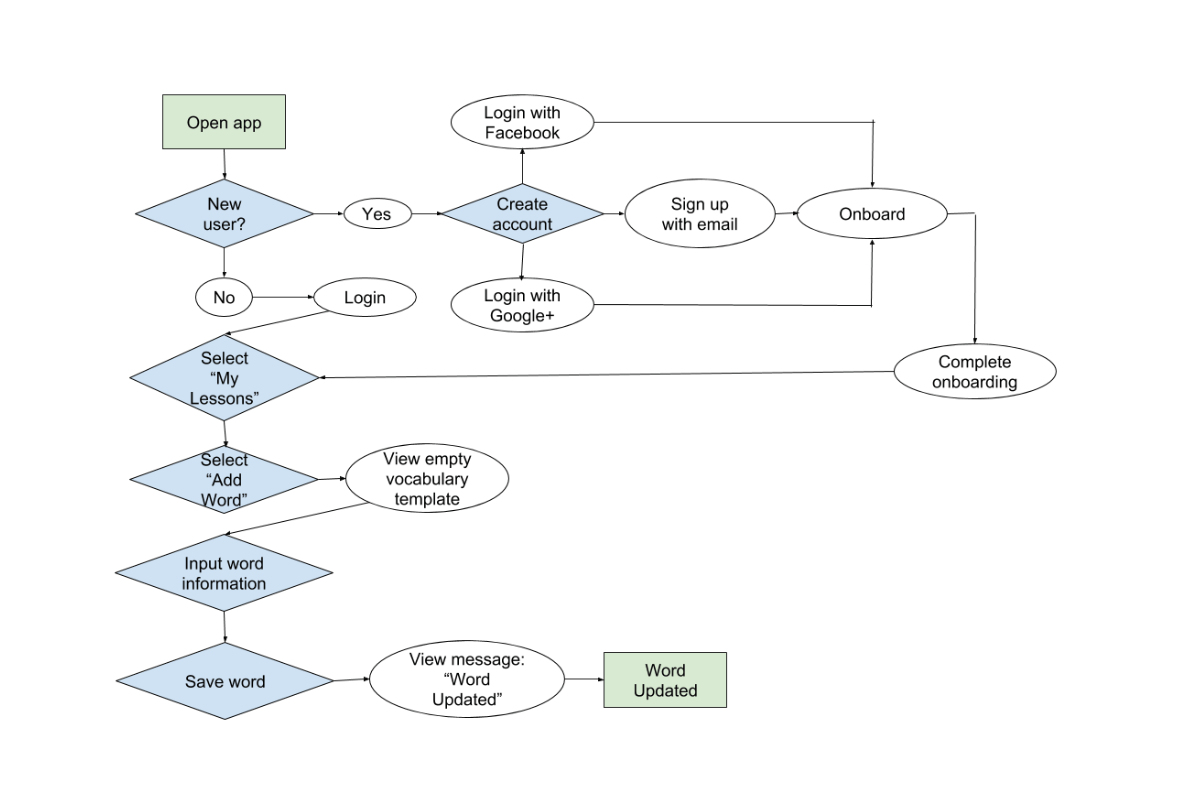
Task flow: Upload a word for review.
Wireframing
Low-fidelity wireframes & prototyping
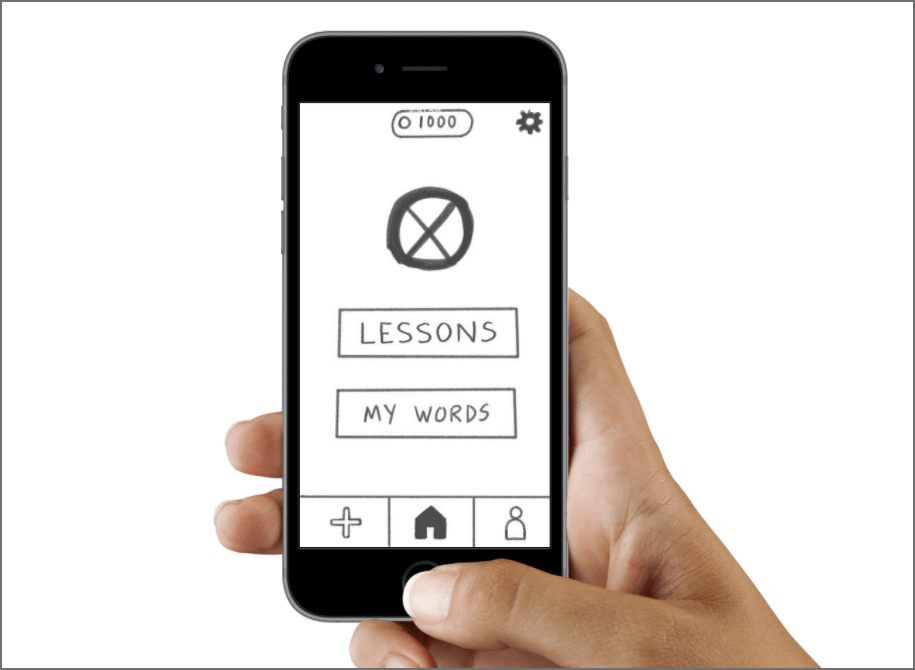
For low-fidelity wireframes, I kept it loose and unrestrained by creating low fidelity wireframes with sticky notes using rapid prototyping.
After rapid prototyping, I selected the best screens and drew them in Adobe Photoshop. The result was a prototype that looked unfinished and messy, but allowed users to focus on the process over the visuals.
After learning to use Adobe XD, I must say that I would probably not use this process again as it was slow and methodical.
Low-fidelity wirefames & prototype
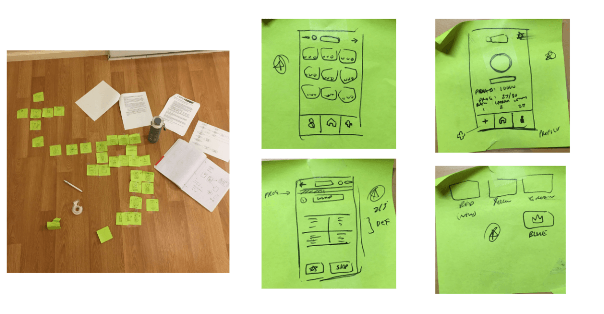
WordStorm rapid prototyping sketches.
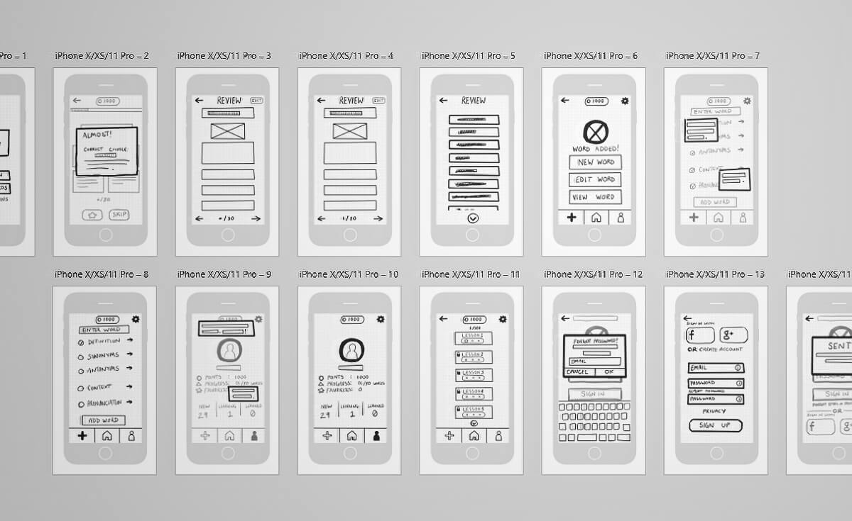
WordStorm low-fidelity wireframes.
Usability testing
Goals
After completing wireframes and prototypes, it was time to conduct usability testing to measure how successful the WordStorm prototype was at helping first-time users fulfill core tasks.
Test scenarios
- Sign-Up for WordStorm and finish the onboarding process.
- Add your own word to the app.
- Study from a set of words.
- Add a word from the quiz to “My Words.”
Methodology
For this test, I conducted usability tests with 3 participants. Each session was in-person and took approximately 10 to 15 minutes to complete. All participants used my iPhone SE for the test.
3 participants
15 to 20 minutes each
Tested on iPhone SE
Interpreting the results
I was excited for these tests since they were my first usability testing sessions, and I was surprised to see just how many tasks didn’t go as planned.
Main test findings
- Sliding didn’t work during the onboarding process. The onboarding process was confusing and hard to navigate. In order for WordStorm to be successful, I’d need to change the app from tap to swipe.
-
Users wanted to highlight their incorrect answers for more review. Users were frustrated that they couldn’t bookmark or save words that they answered incorrectly, and wanted a way to save them in one location for later
review. This was resolved by adding an additional CTA after an incorrect answer. - Users wanted more directions. After entering a quiz, some users had no idea what was expected of them, and grew frustrated after tapping around and triggering an incorrect answer.
All of these findings were unexpected, but crucial to fix to make WordStorm as successful as possible.
Final designs
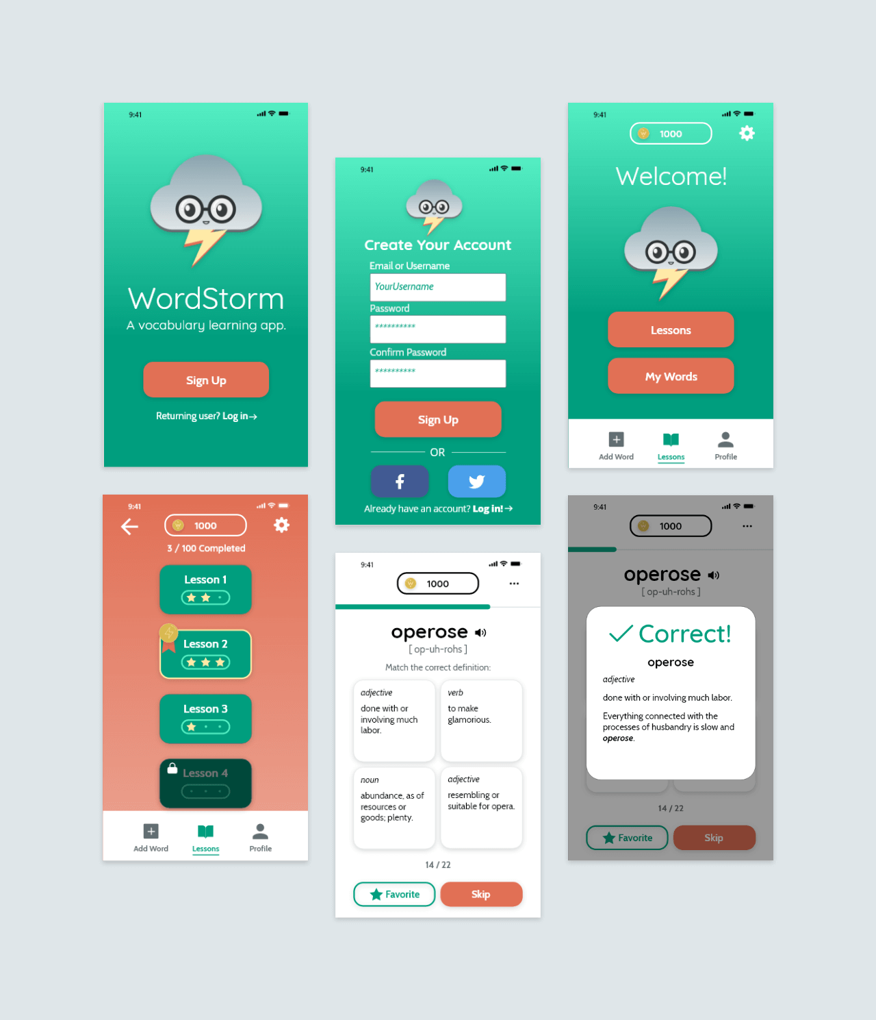
The project technically ended after the testing concluded, and WordStorm could have ended there. However, after completing Ink Tank I decided I wanted to try creating some screens for WordStorm.
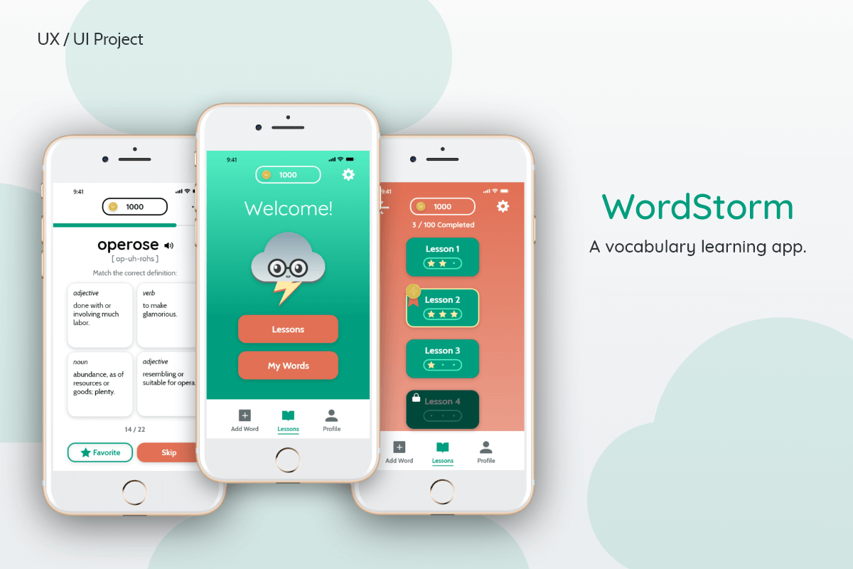
A main point of designing these screens was to experiment with animation and how I could emphasis interactions and make them fun and engaging. Below are some examples of the polished screens I created for WordStorm.
Clickable prototypes
Low-fidelity prototype
After finalizing the wireframes, I used Prott to create a low-fidelity prototype for the usability tests.
Animated prototype
After testing the low-fidelity prototype, I wanted to flesh out WordStorm and see how it would work.
In reflection
WordStorm was my first project where I got to think like a UX Designer. It was new, and exciting, and messy, but it helped me understand what processes I did not like, and how I could improve upon them for my next project: Ink Tank.
Using what I know now, I would like to complete the screen designs and conduct new user tests with 5-6 users to see how they react and hear their thoughts.
Overall, this project was fun and I’m looking forward to what else I can do with WordStorm in the future.
