Jump to a section in the story:
About the project
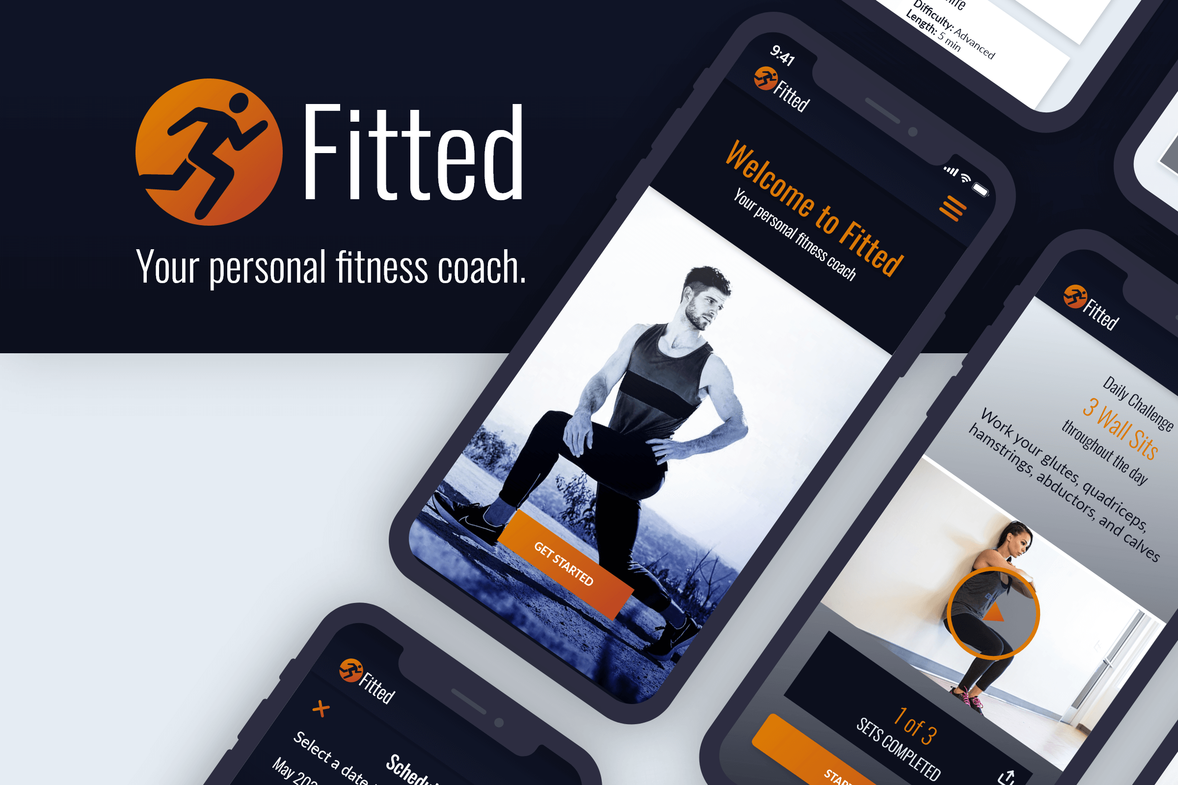
Fitted is a UI design project designed to get people excited and motivated to workout and get fit.
The goal for this project was to create polished and consistent screens based off existing user research and an existing user persona.
Since I was working with an existing user persona, I already had my goals and key features pre-defined for me. This helped me understand the functionality of the app, and let me focus more on the feel.
My process
Task Flows
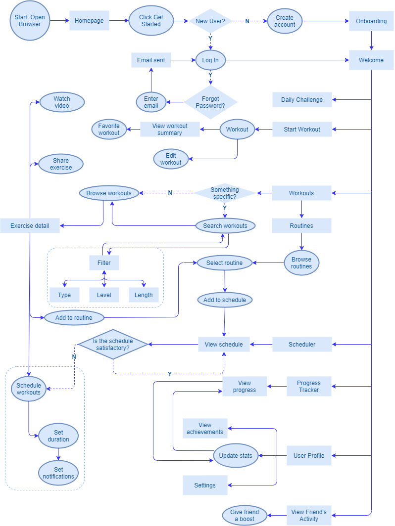
For this project, I created a task flow that combined multiple user goals into one diagram. As I worked on the task flows, I organized and established the site hierarchy using a site map as well.
By combining both the site map and the task flow into one document, I was able to form a solid understanding of what screens were needed and how they’d relate to each other.
Wireframes
Starting from scratch with pen, paper, and rapid prototyping
Since the user research was already completed, I had a solid idea as to what was needed to make the app successful. After completing the site map and visualizing the task flow, it was time to design the screens.
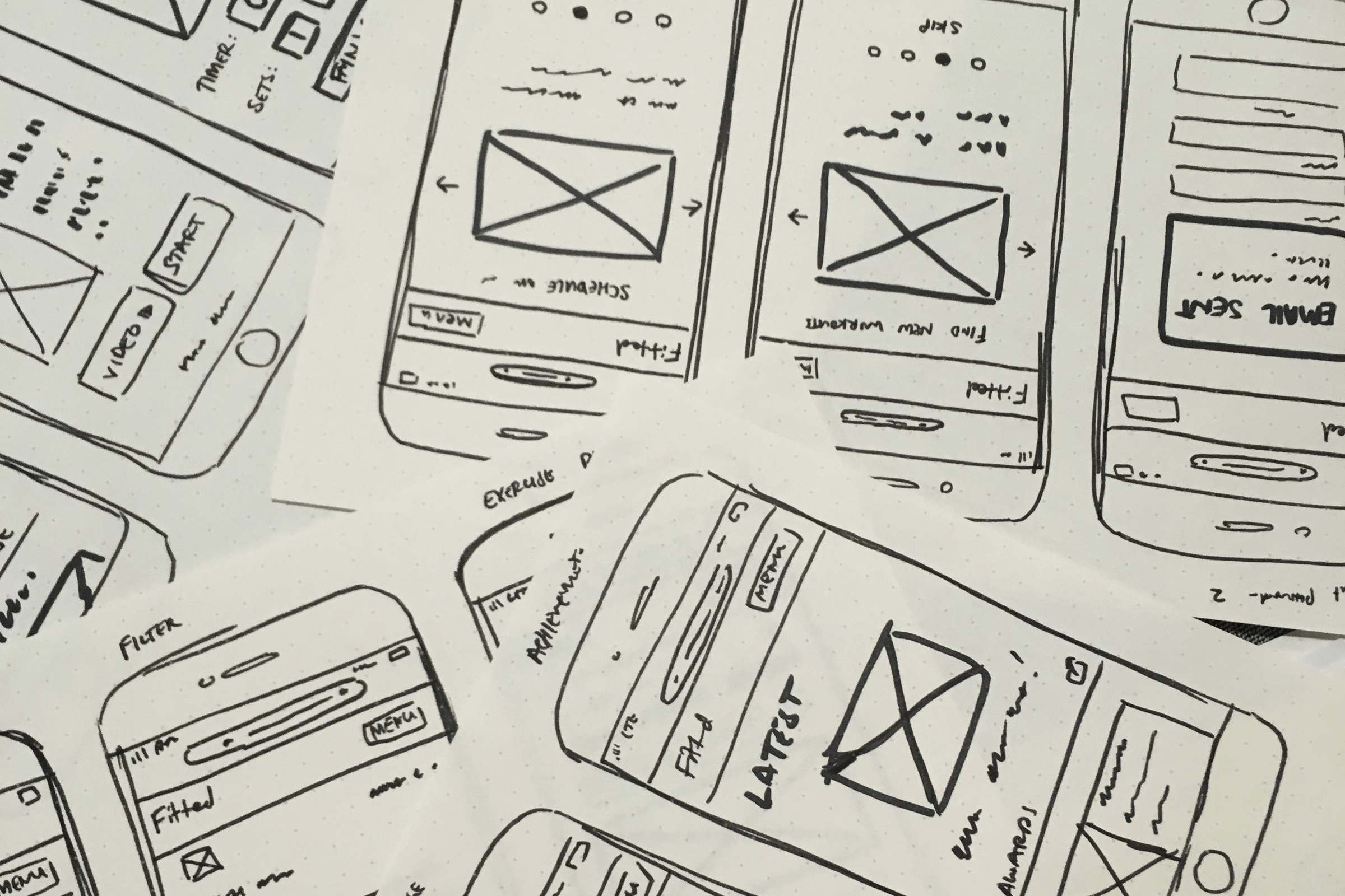
Low-fidelity wireframes
To get a feel for how the app would look, I started out with dotted paper and scribbled down screens using marker. This kept the design loose and organic, and it allowed me to experiment without feeling too committed to the design.

Building the design
After drawing the low-fidelity wireframes, I tested the screens with several users for feedback. After processing the results and making notes, it was time to apply the edits in mid-fidelity wireframes.
Mid-fidelity wireframes
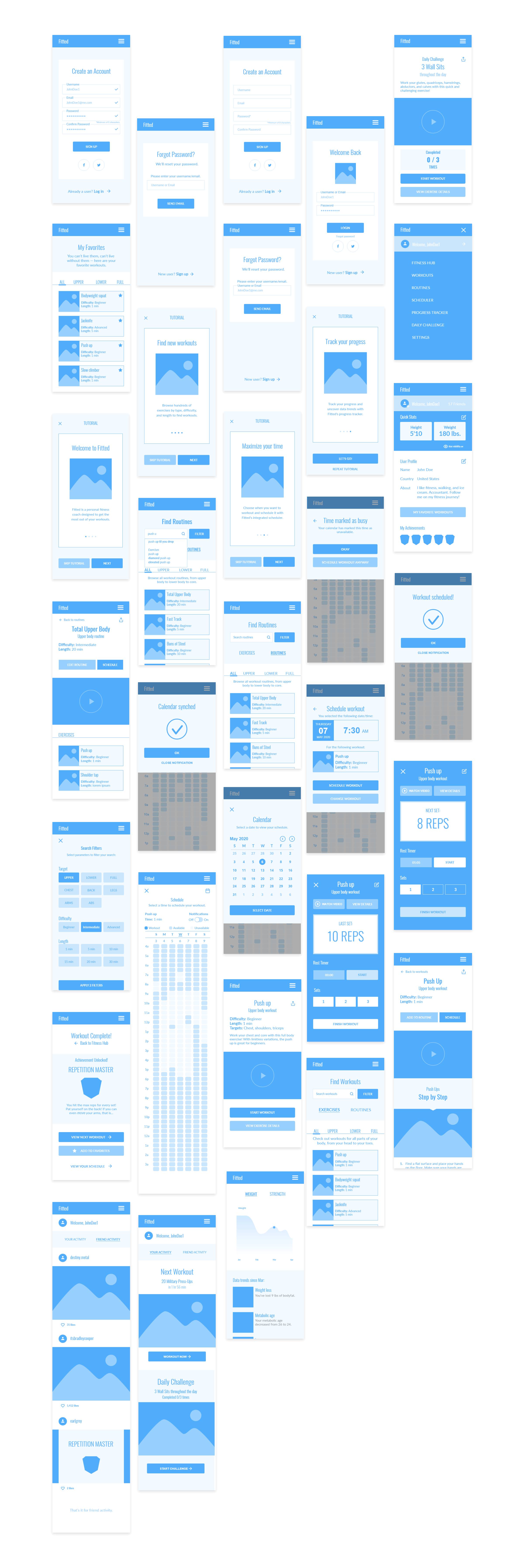
I used Adobe XD’s wireframe kit to build the screens for this app. I like the kits because it helped me establish a consistent design and hierarchy for Fitted, and the blue made this stage feel more friendly and human. I also included
important text and features, and dropped placeholder images where relevant.
A growing process
As I made the mid-fidelity wireframes, it became apparent that certain features and layouts weren’t working.
To avoid creating more work down the line, especially during stages where the app was more finalized and edits would be harder to implement, I revised the screens as I went along.
Moodboard: Establishing the visual direction
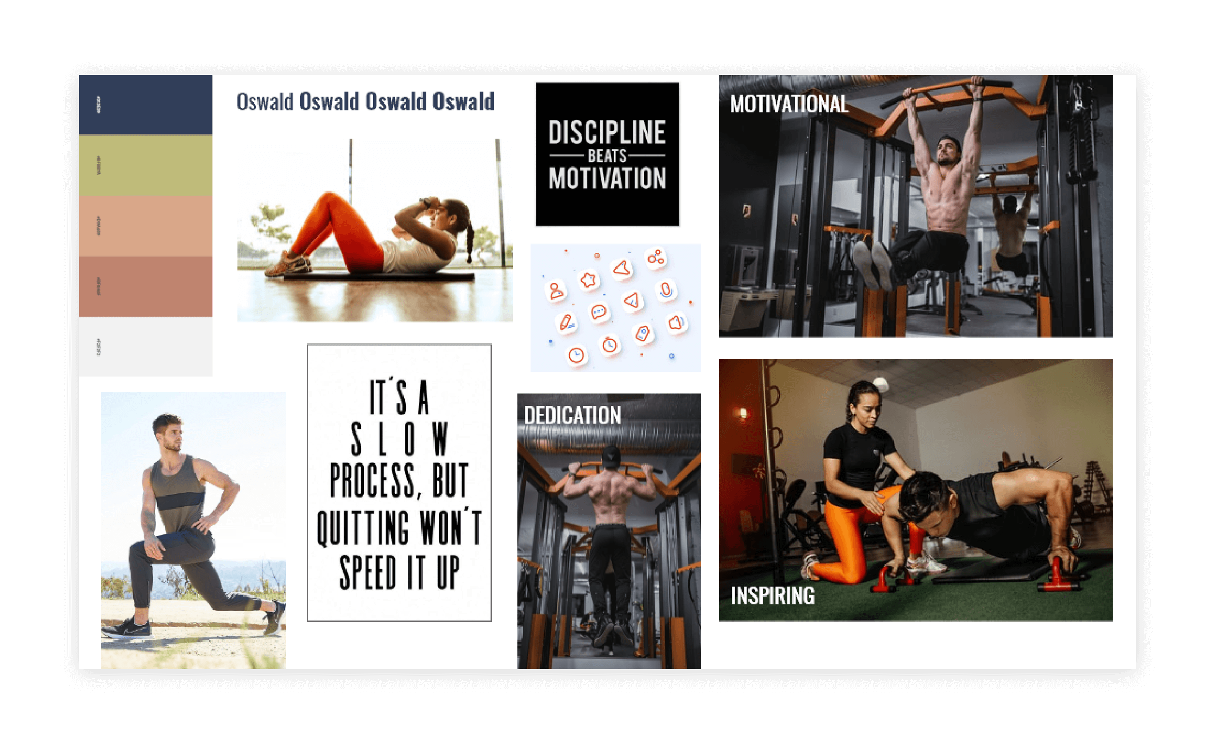
With the bones and muscles of the app completed, it was time to flesh out the surface. I’d never really used moodboards before, so this step felt exciting and new. It was sort of like an Easter egg hunt, but with font, color, and images.
Finding the starting point
After scouring the web, I landed upon a limited color palettes using oranges and blues with photographic images. Even though the actual design slowly changed in direction as I created the app, the main feel stayed true.
I was surprised by how effective moodboards were for establishing feeling and communicating ideas, and I plan to use them more in the future.
Outlining key screens and features
After setting the mood and creative direction, I created the high-fidelity wireframes. I started off with the key features of the app, and worked to make the functionality as clear and easy-to-understand as possible.
Designing with accessibilty
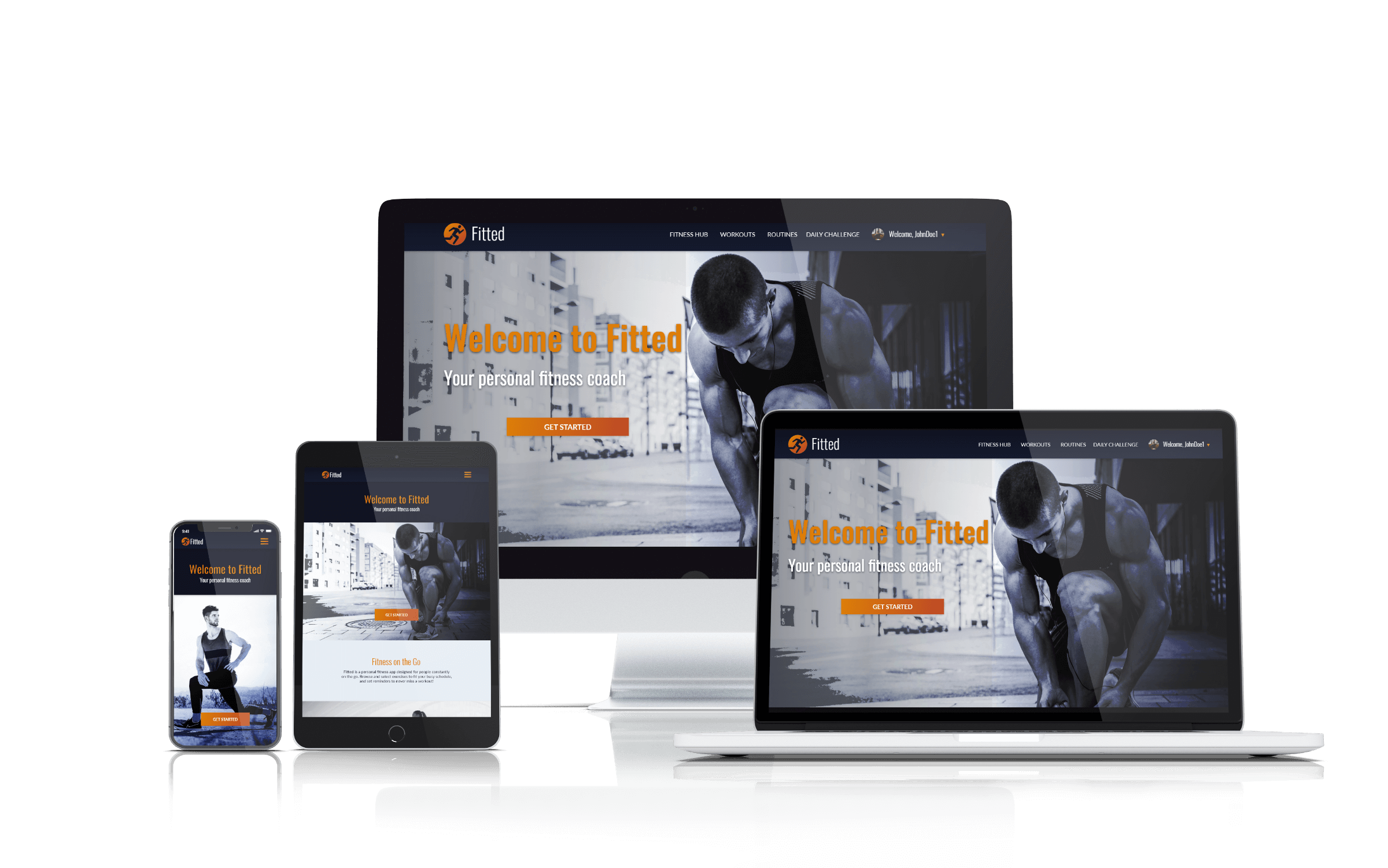
As a responsive web app, it was important to me to design Fitted in a way that was accessible to all users. For that reason, the color palette has been thoroughly tested to ensure WCAG AA compliance and elements were resized to make
tapping easier.
In addition to establishing the color palette, I also animated subtle transitions to give the app a consistent and cohesive feel. Because this app would be primarily viewed in web browsers, I wanted to make sure most animations could be
accomplished with simple CSS transitions.
Exploring key features
While designing Fitted, the following key features were taken into consideration.
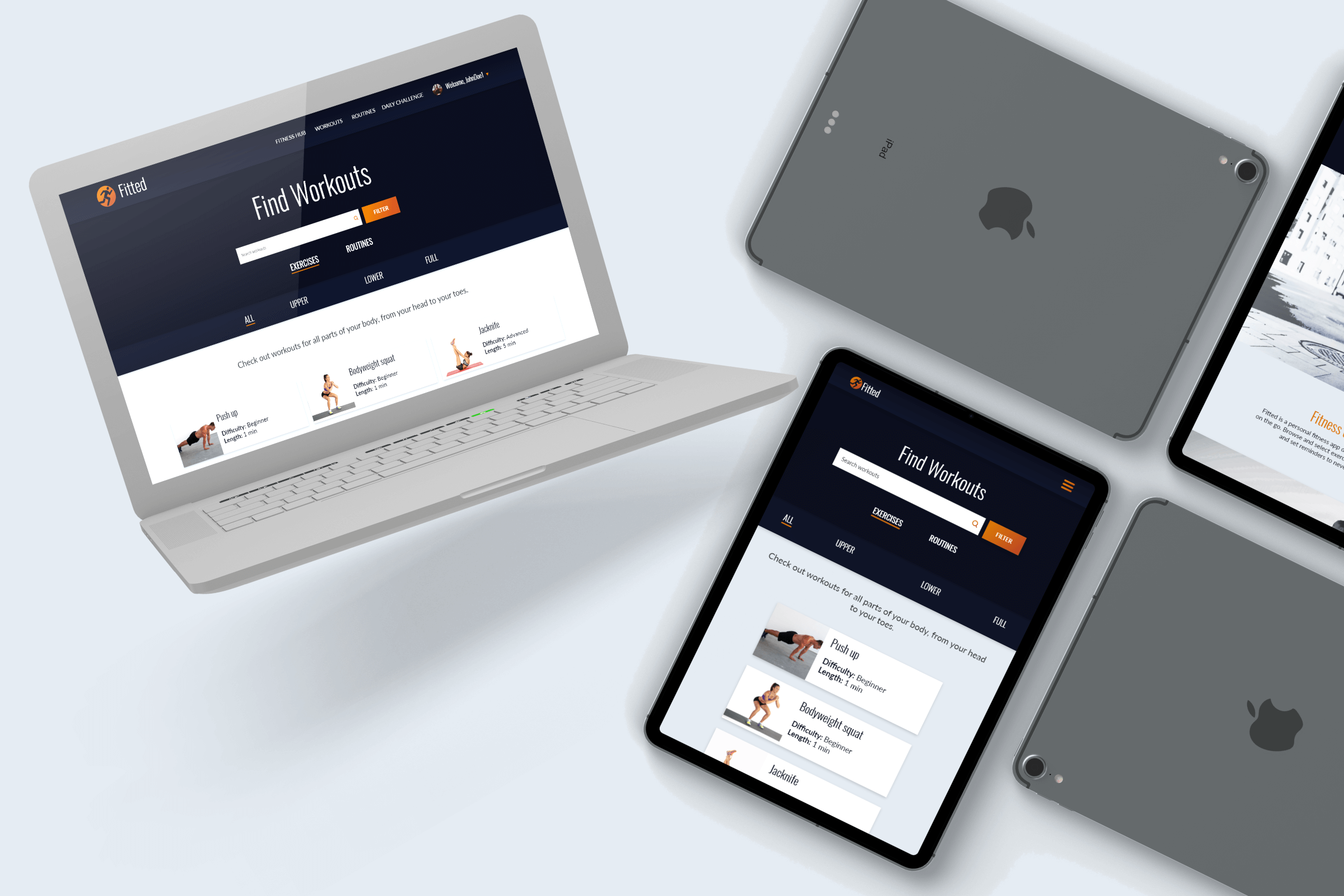
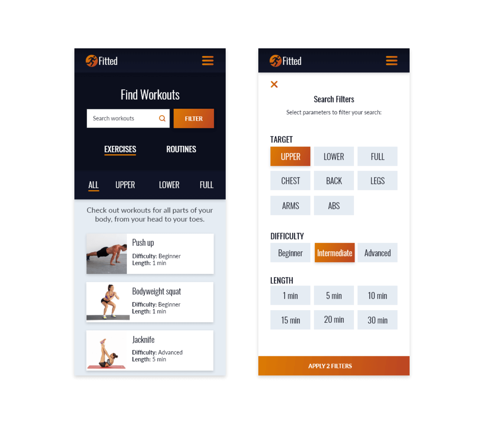
Search and filter
Fitted is designed for users of all ages and fitness levels with varying goals and abilities.
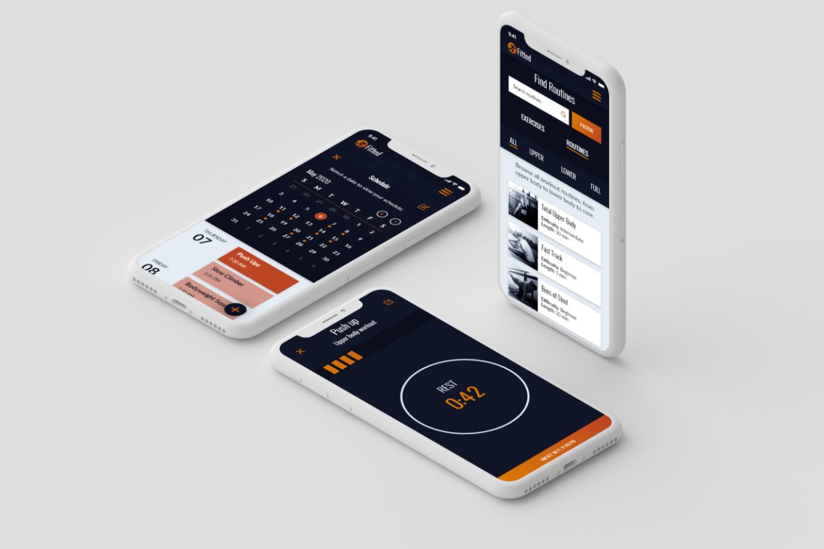
To help users find exactly what they’re looking for, filters are used to search by the targeted muscle group, difficulty, and length of time.
This allows users to find the exact bodyweight exercise they’re looking for and understand how to fit it into their busy schedules.
View and schedule workouts
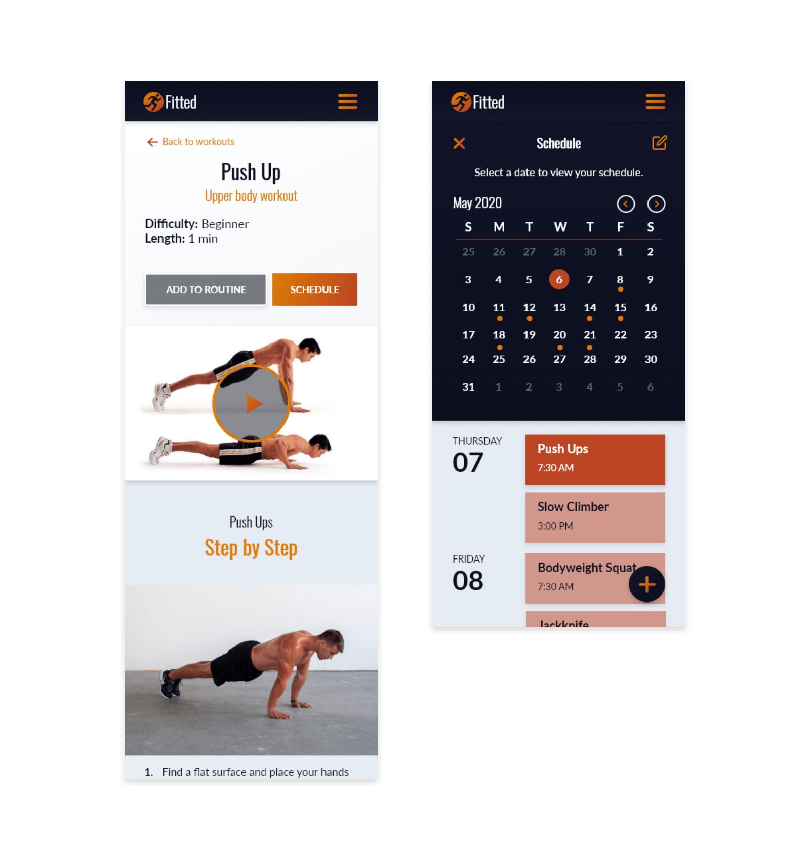
Since Fitted is designed for users with busy schedules, it’s important to help them make fitness as easy and accessible as possible.
Exercise detail pages highlight key pieces of information, display videos, and explain how to perform the workout step-by-step.
If a user wants to schedule the workout, they can add it to their schedule using Fitted’s integrated calendar.
The calendar is set to sync with the user’s device or calendar app to keep working out as simple as possible.
Get coached and motivated
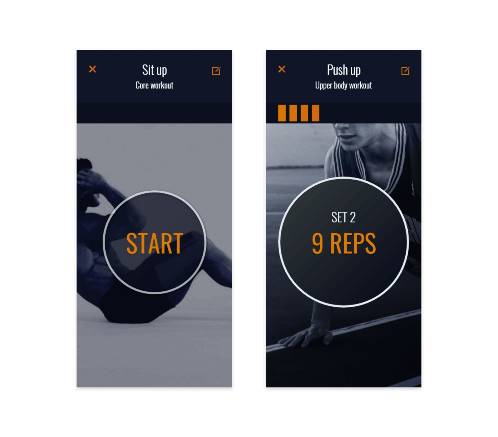
When the user is ready to workout, they’ll use Fitted’s personal fitness coach to get them started.
Upon entering the workout, they’ll face a workout screen with a start button and a background that provides additional context for the workout they are to perform.
After tapping start, users are guided through their reps or time, and given rest times as well. A progress bar shows them how far along they are in their workout.
Unlock achievements and share with friends
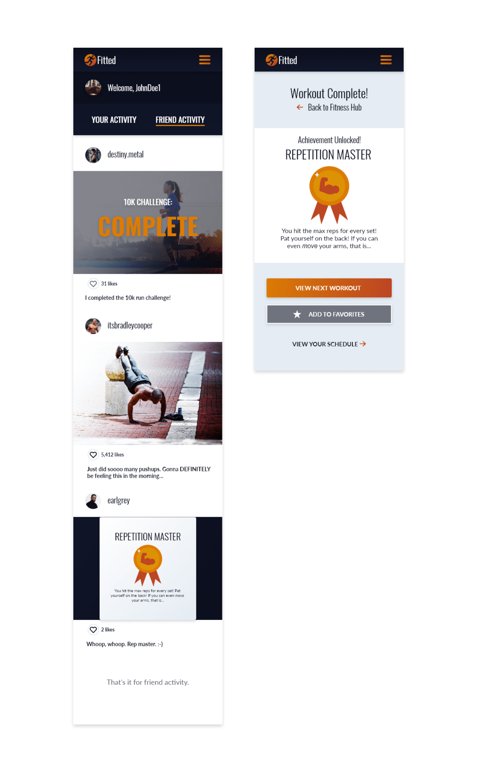
As users progress in fitness, they’ll unlock achievements and badges that will be displayed on their profile or shared with friends.
Friends can support each other as they move along, and hold each other accountable to their fitness goals,
This also adds a bit of a game element and helps a user feel rewarded when they accomplish a task.
Style Guide
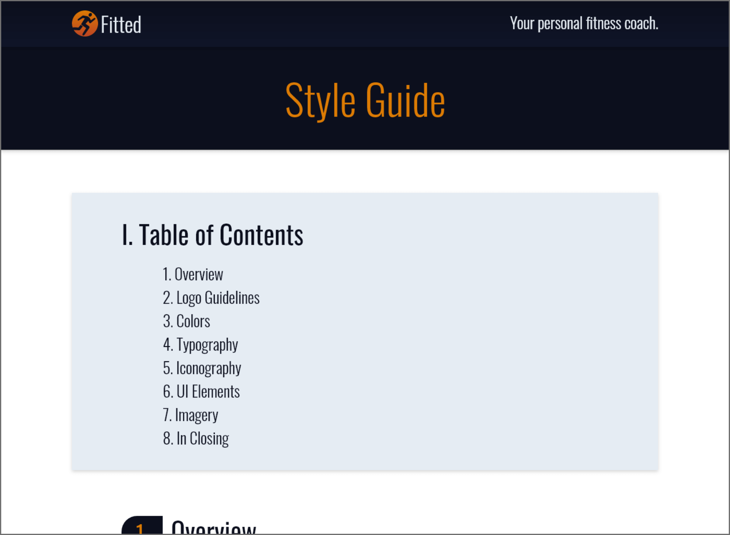
The visual style guide is meant to serve as a compass for working with and designing for Fitted. These guidelines will allow Fitted to continue to be a familiar and cohesive experience for users as we roll out future updates and iterations,
and stay true to the Fitted brand identity.
Final screens
Viewing the finished product
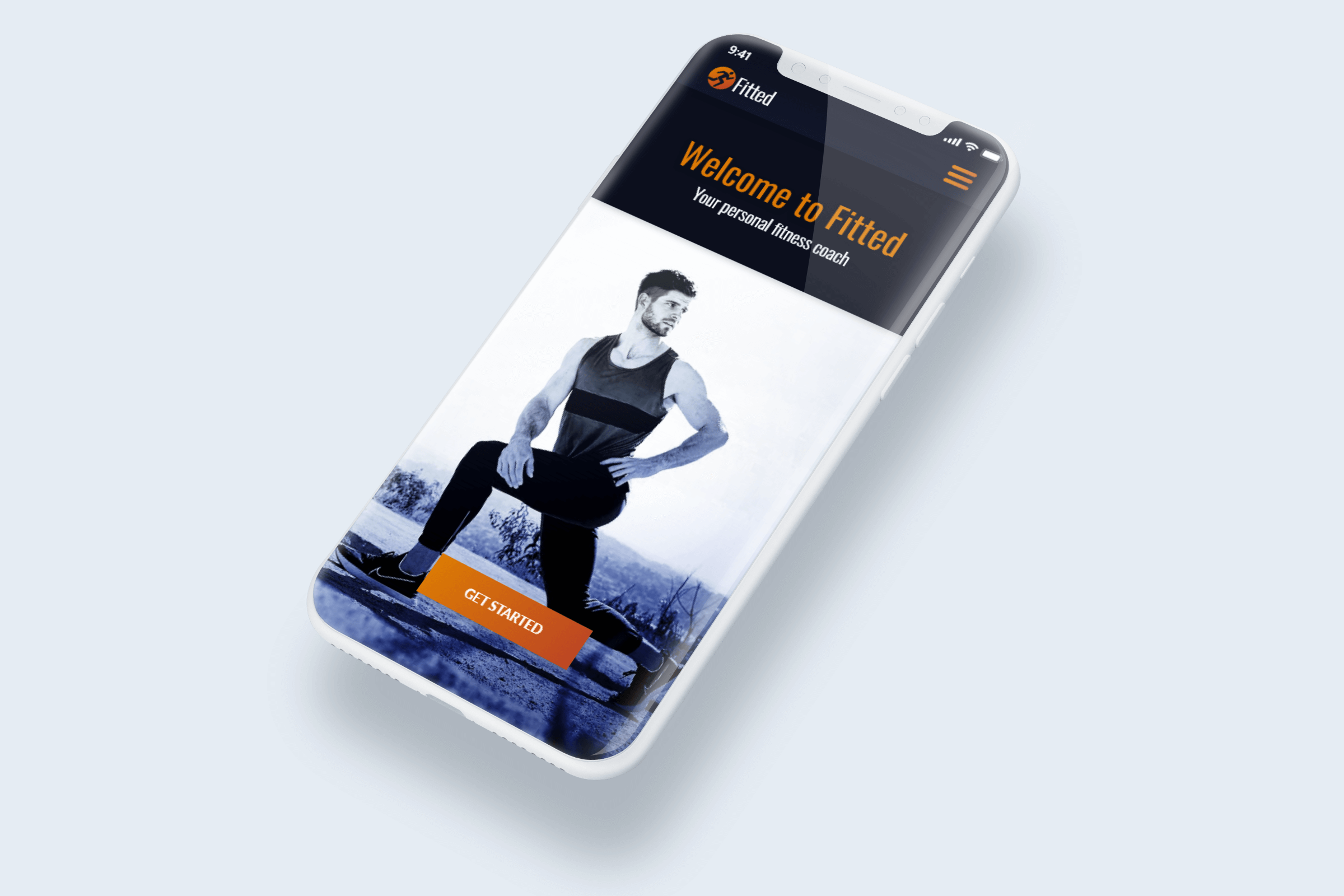
After establishing the style for the product, I polished the final screens for Fitted and linked them together via an Adobe XD prototype.
Many screens changed in appearance in look and structure from the mid-fidelity wireframe stage, which added some time to the project, but all the edits were necessary to create the best project I could.

Prototype
After completing the design, it was time to put the final prototype together. Feel free to play with the embedded prototype below, or click here for the online prototype.
In Reflection
An exciting opportunity for new skills
As someone with experience in UX research, front-end development, and SEO, I felt like my weakest point was always UI. I went to school for animation and illustration, but my focus was mostly on learning how to sketch and paint images with
dynamic compositions.
This project gave me the opportunity to learn more about UI, what goes into good design, and how to make a product look sleek, modern, and enticing.
I feel like I would have liked to perform more competitive research before building the app. Even though the user research was given to me, I feel like I missed out on the opportunity to view the many ways other designers solved for user
problems and how I could improve upon the app more.
In any case, I now have a product I can say I’m proud of — but I understand this is only a starting point. I still have so much to learn.
