Jump to a section in the story:
About the project
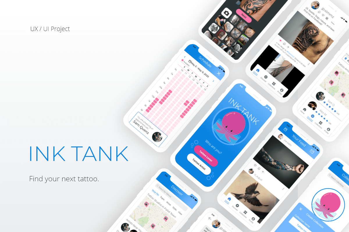
The point of this project was to create a mobile app that allows users to explore the inspiration for tattoo designs according to unique preferences like artist and style.
A secret tattoo admirer
As a tattoo admirer with a background in animation/illustration, I was excited to tackle this project. I even want a tattoo myself, but I’m too skittish to just go out and get one. There are a whole lot of unknowns to consider.
I knew I wasn’t alone in this feeling. I’ve heard many tattoo horror stories, from ink that friends wished they really hadn’t, to cheap tattoos that bled and faded, and even to tattoos that led to an outright infection.
A solution to a problem
I wanted to create an app that solved this problem and let people find both tattoo designs, and tattoo artists, that they truly loved and cherished.
My process
Research
After defining the problem, looking at existing solutions in the market, and analyzing how well they met the needs of users it was time to conduct research.
Research goals
My goals were to understand how likely users were to use an app for tattoo inspiration, how they decide upon designs, how they select their tattoo artists, and what sorts of feelings they experienced after a tattoo.
Method 1: User interviews
To get started, I interviewed 3 people and asked them 8 questions about their experience with tattoos, getting a tattoo, or researching for a tattoo.
Method 2: Online survey
At the same time, I ran a 10-question survey on Google Forms asking people about their experience with tattoos. Participation was voluntary, and the survey received over 90 responses.
Ideation
Surprising insights
- People don’t (usually) regret their tattoos. Surpisingly, most users don’t regret their tattoos, and if they do, they just get it covered by a larger tattoo later.
- Finding designs is easy; finding artists is hard. Users had an easy time finding designs online, but had a hard time finding artists near them that they genuinely connected with.
- Tattoos are a social experience. I hadn’t anticipated how social tattoos are. Tattoos are pretty collaborative, and many people even get tattoos with friends or family.
Potential solutions
- Bring organization to chaos. Users would benefit from an app that sorts tattoo designs by type, size, and style so they can collect and share designs with friends and other users.
- Offer more than just tattoo studios. Allow users to search for artists, both studio and independent. Offer ways to message artists directly to spark creativity.
- Give users control of their time. Being able to control their schedule and sign up with friends is important to users. Offering flexible scheduling options would be beneficial.
User persona
After completing the user interviews and survey responses, and organizing my analysis and findings, I had enough data to build out examples of the ideal users for Ink Tank.
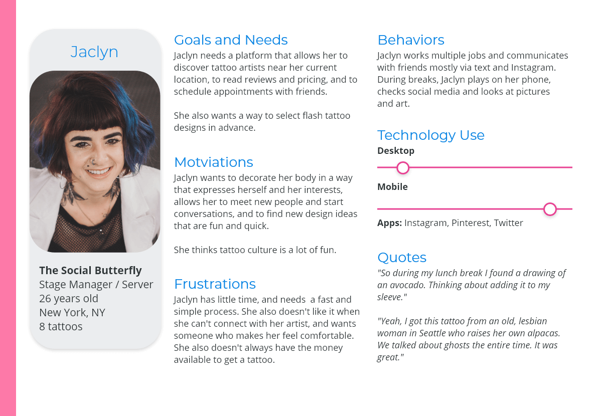
User persona: Jaclyn, the Social Butterfly.
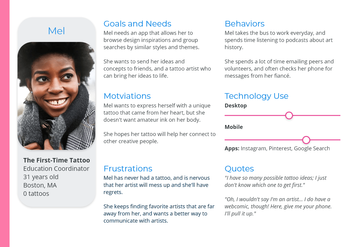
User persona: Mel, the First-Time Tattoo.
User journeys
After completing the user personas, it was time to figure out how they think. People aren’t static — we’re dynamic and experience many different situations.
A chance to explore thought
Mapping out user journeys helped me explore the user’s thoughts and experiences as they used the app, and helped uncover important features Ink Tank would need to be helpful.
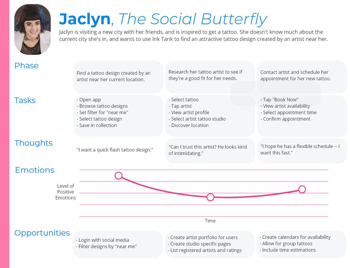
User journey: Jaclyn.
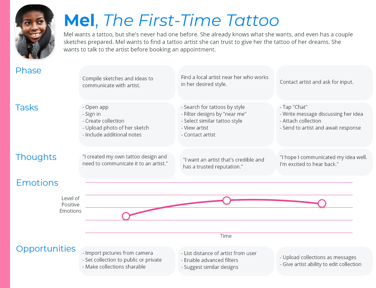
User journey: Mel.
User task flows
After completing the user personas, it was time to figure out how they think. People aren’t static — we’re dynamic and experience many different situations.
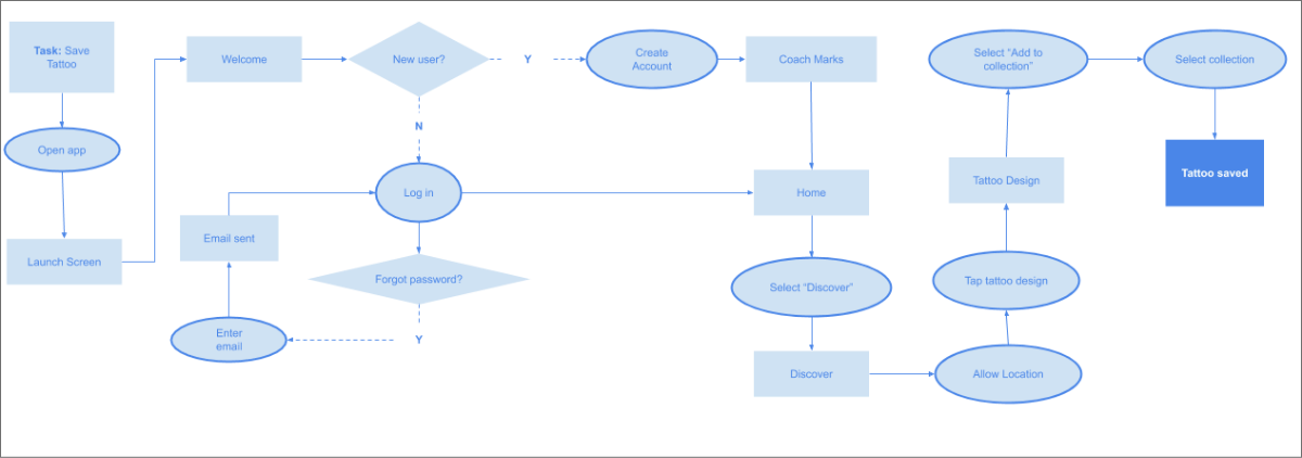
Task flow: Save a tattoo design.

Task flow: Upload a picture to collection.
Problem: Information retention
It surprised me with just how many steps users had to go through to accomplish tasks, and it seemed they would need to be guided as they worked through the task flow.
Solution: Coach marks
For that reason, it became clear that coach marks would be more helpful to users instead of onboarding screens. Coach marks would help users understand the app as they explore versus having to memorize everything beforehand and searching
for help once stuck.
Sitemap
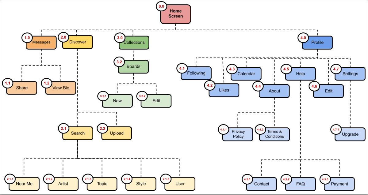
At this stage, Ink Tank was beginning to come together, but it was important to build out the framework. Realistically, there had to be two different sitemaps for the app: one for tattoo lovers, and one for tattoo artists.
This stage was crucial for figuring out the total scope for Ink Tank, and prevented the app from spiraling out of control.
Wireframing
Low-fidelity wireframes & prototyping
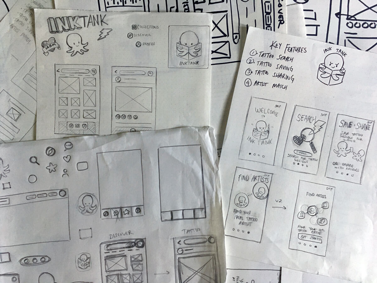
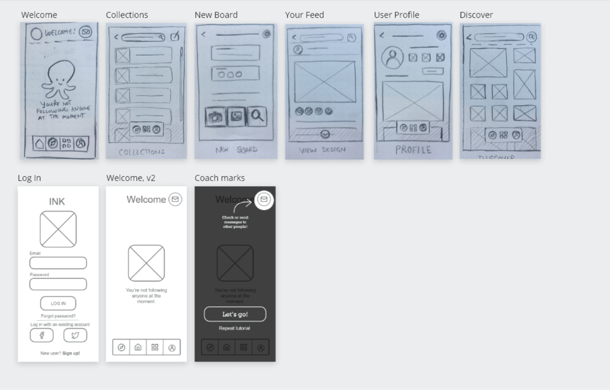
For low-fidelity wireframes, I started out with sketches. The idea was to start off messy, loose, and open-minded, so I opted for paper wireframes drawn with pencil and sharpie. After brainstorming different screens, I selected the
strongest ones and constructed paper prototypes.
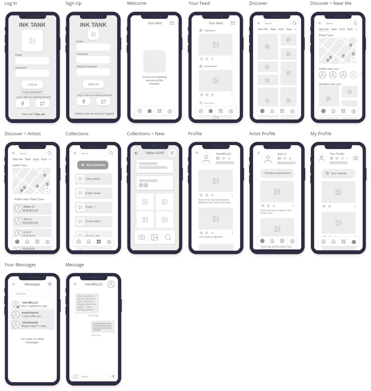
Mid-fidelity wireframes
After exploring how the app would work on paper, it was time to build a prototype. I used Adobe XD to create mid-fidelity wireframes. This stage challenged me, since I never used XD before. Fortunately, the program is really intuitive, and
after an online crash course (and many, many YouTube tutorials) I was on my way to start usability testing.
Low-fidelity wirefames
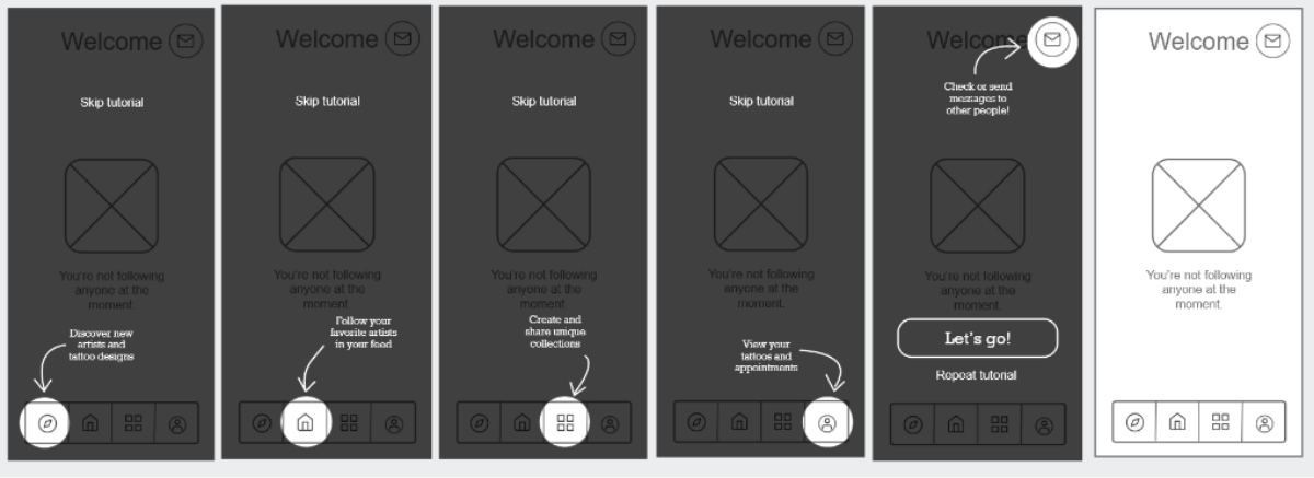
Ink Tank coach marks to help users retain info.

Early rapid prototyping sketches.
Mid-fidelity wireframes
Usability testing
Goals
After completing wireframes and prototypes, it was time to conduct usability testing to measure how successful the Ink Tank prototype was at helping first-time users fulfill core tasks.
Test objectives
- Determine the success of login/onboarding screens.
- Determine the success of adding an image to a collection.
- Find out how effective the search is for tattoo artists and designs.
- Determine the success of appointment scheduling.
Methodology
For this test, I conducted usability tests with 6 participants. Each session was in-person and took approximately 10 to 15 minutes to complete. Sessions were recorded with user consent to capture observations accurately.
6 participants
15 to 20 minutes each
Tested on iPhone
Interpreting the results
Making sense of it all
I was surprised by how smooth the tests went. I found I really enjoyed talking to people and seeing, hearing, and observing their reactions to the app. While the tests highlighted some critical errors with the design and the prototype,
there were many more insights that I could pull from the data.
Affinity mapping
After completing the usability tests, I used affinity mapping to organize and make sense of the findings.
As I reviewed the hours of recordings, I organized my observations into four categories: observations, positive thoughts, negative thoughts, and errors.
Main test findings
- Users were confused by scheduling. The scheduling process was a bust. I tried creating something original, and instead designed a process that was bloated and confusing. I addressed this issue by looking at more
scheduling task flows and making adjustments. - Users were unsure of how to upload images. Similar to the scheduling process, users had difficulty uploading images. I fixed this issue by using a more common UI pattern so users didn’t have to retrain themselves.
- Some users were stumped by the sign-up screen. I hadn’t anticipated that some users would get stuck at the sign-up screen. An app that users couldn’t sign into was essentially useless. I revised the sign-up screen
to be more helpful to users. - Users grew frustrated trying to navigate the app. Without labels, users had a hard time understanding where tapping icons would take them in navigation. This issue was addressed by updating the icons and adding text
labels.
What was surprising to me was just how many critical errors I uncovered with 6 simple sessions. These sessions gave me invaluable knowledge that made Ink Tank a better product — and me a better designer.
Design iteration
Applying the results
After reviewing the findings from the usability tests, it was time to make changes and polish the user interface. I asked 8 peers to review the app and provide their feedback.
This stage was by far the most eye-opening to me, and showed me just how much I can learn from others. I really enjoyed this step, because it gave me the information I needed to really push Ink Tank to the next level.
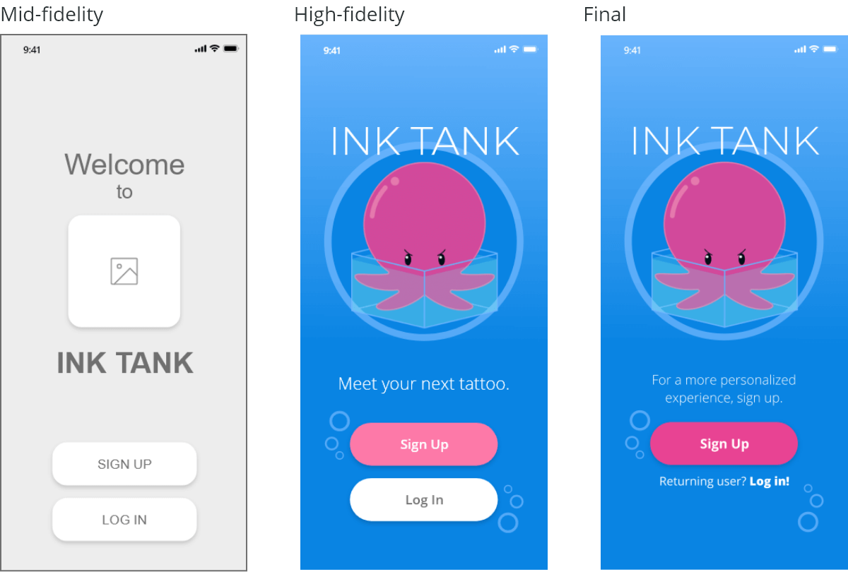
Sign up
- Removed welcome language to focus on guiding the user through the task.
- Used a grid-based framework to build a polished UI.
- Removed login button to prompt users to most helpful action.
- Added additional screen before Sign Up screen which asked users who they were: Tattoo lover or a tattoo artist.
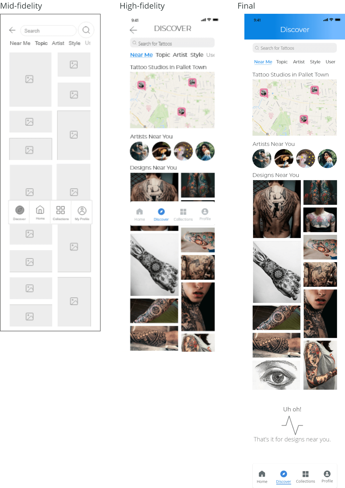
Discover
- Added map to assist users in finding designs and artists near them.
- Used a grid-based framework to build a polished UI.
- Adjusted font size to create a stronger hierarchy.
- Added additional elements to navigation to help users understand their location within the app.
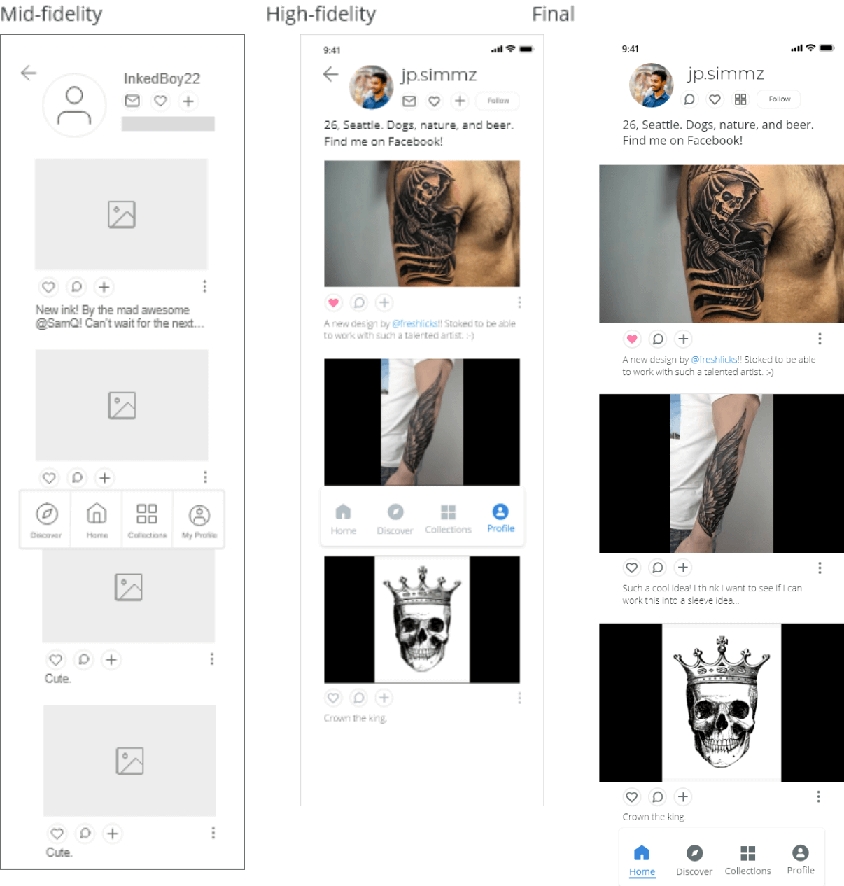
User profile
- Adjusted spacing using grid-based design.
- Removed the “back” button — interrupted profile flow and didn’t make sense in task flows.
- Made images larger to increase visibility and emotional impact.
- Changed icon for chat — originally used icon for email instead of messaging.
Style guide
Easy to read, easy to use
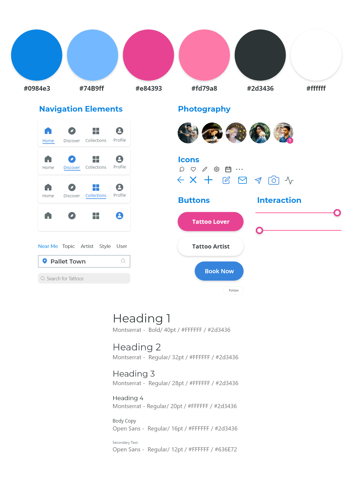
When designing Ink Tank, I wanted a font that was easy to digest and wouldn’t fatigue the user during extended sessions.
For this reason, I chose Open Sans for the body copy, and Montserrat for the headers. Choosing a different font for the headers would help to establish hierarchy and better separate headers from the content.
A fresh & bright color palette
The color palette for Ink Tank was inspired by American designer Kevin Yang, and incorporates bright pinks and cool blues.
Similar to the font, I wanted a color palette that was refreshing but didn’t exhaust the user’s eyes during long sessions.
Ink Tank: Style guide
Final design
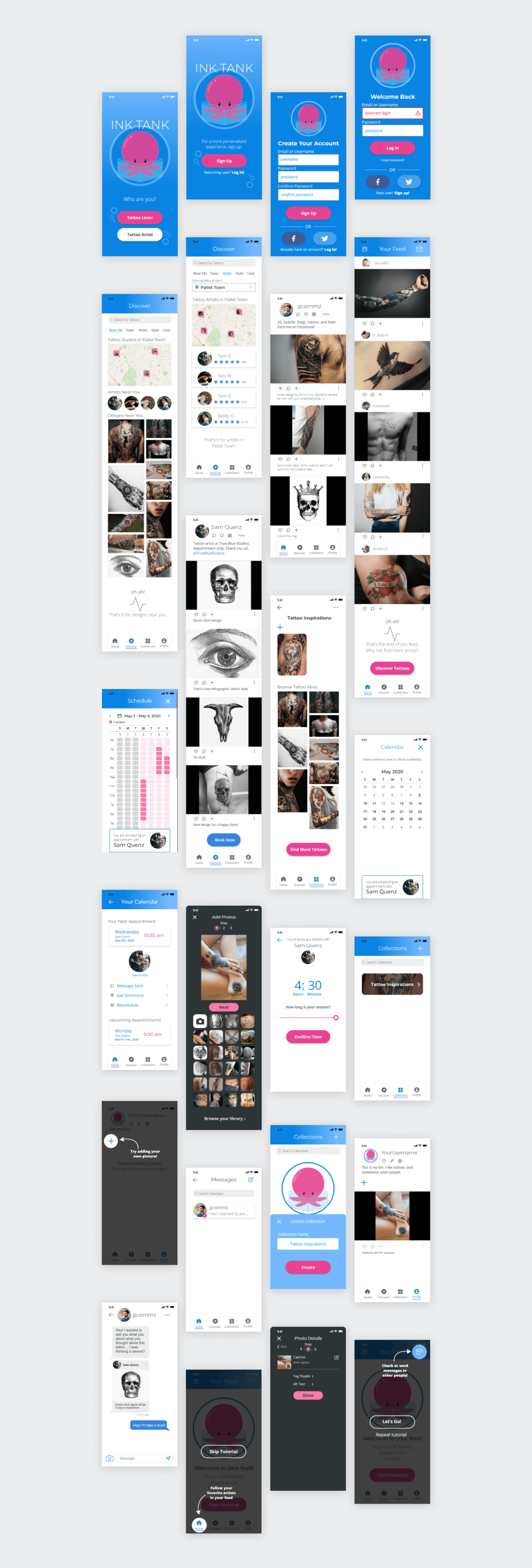
After rounds of testing, review, redesign, and revision here are the final screens for Ink Tank.
Prototype
After completing the design, it was time to put the final prototype together. Feel free to play with the embedded prototype below, or click here for the online prototype.
In reflection
Ink Tank was my first project for UX Design, and I cannot believe how much I’ve learned along the way. I’ve learned new methods of thinking, exploring solutions, and designing screens for users.
If I were to revisit Ink Tank, I’d like to change how users interact with artists and studios, and explore new ways for users to collaborate on tattoo discussions, not just designs.
Looking back, I definitely couldn’t have done it on my own, and I have so many people to thank for their feedback and input along this journey. I’ve learned so much, and I’m excited to carry what I’ve learned onto my next projects.
